Features
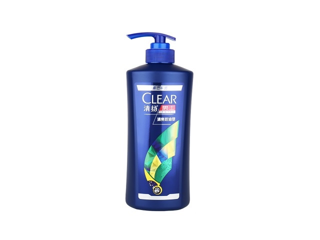
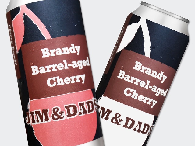
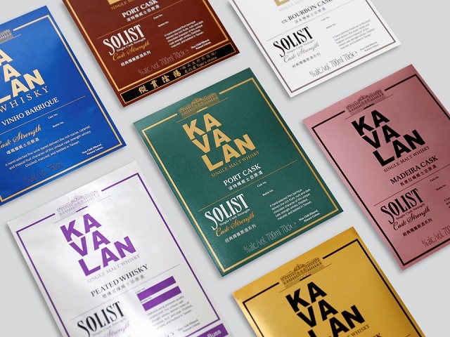
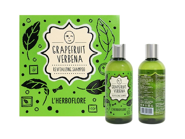
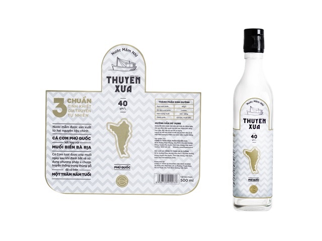
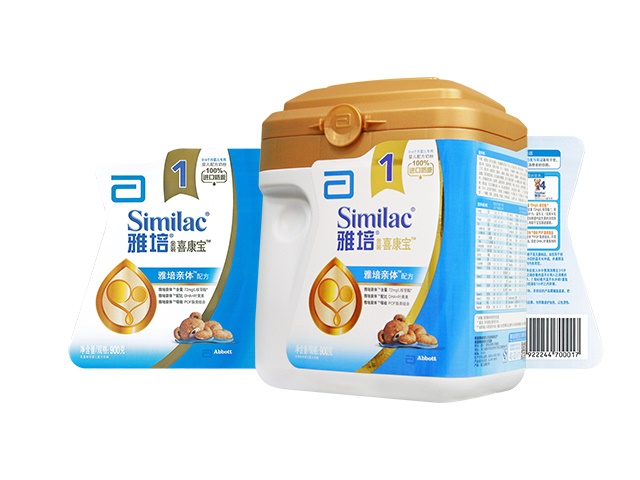
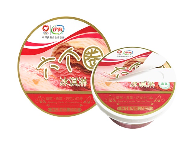
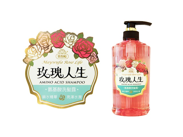
- Deliver brand and product information
Benefits
- Enhance brand image
- Boost product sales
- Grab consumers' attention
Applications
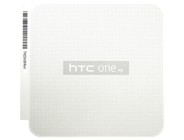
Success Stories: HTC Colorful Dots Box Label
Requirements
- Customer had introduced a representative product which was a polka-dot protective cover with classic and chic style, so customer hoped can extend this concept to their new product packaging.
Solutions
- The combination of doming ink and special silver powder could be printed as evenly filled dots on the packaging box lid with the special 3D tactile feedback, which helped to grab consumers' attention.
- The middle area had been changed to metallic color. It wouldn't reflect light from different angles. With the colorful ink, the logo became very vivid.
Success Stories: Slek Shampoo Label
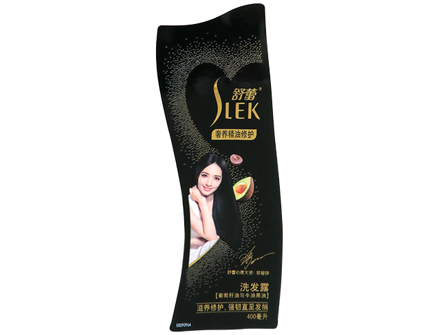
Requirements
- The little sparkling foil stamping dots at the background were the pearl effect we tested and anylzed for the customer, in order to increase product quality.
Solutions
- Used flexography printing process 200L to print the character graphic, which could see the fidelity and details of the face graphic.
- Used all black color as background and combine with foil stamping, flexography printing to create the metallic and pearly luster on label, gave artisan look to product.
Success Stories: Deonte Wine Label
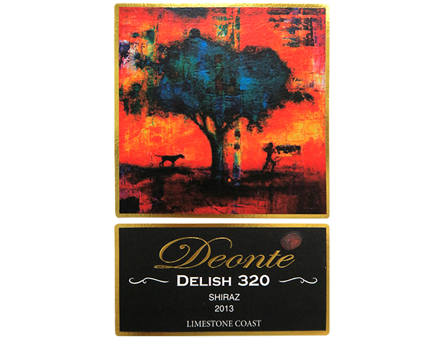
Requirements
- The product was limited and targeted high-end star hotel, so the customer required using an oil painting to present the features of wine, such as pure, thick taste and sweetness.
Solutions
- Using the contract colors, light and shade, thick and thin to increase layered, and used oil painting to present the features and value of the limited wine.
- Used exquisite laser foil stamping at the rim to create a picture frame around label, and enhace the elegant appearance of the label.
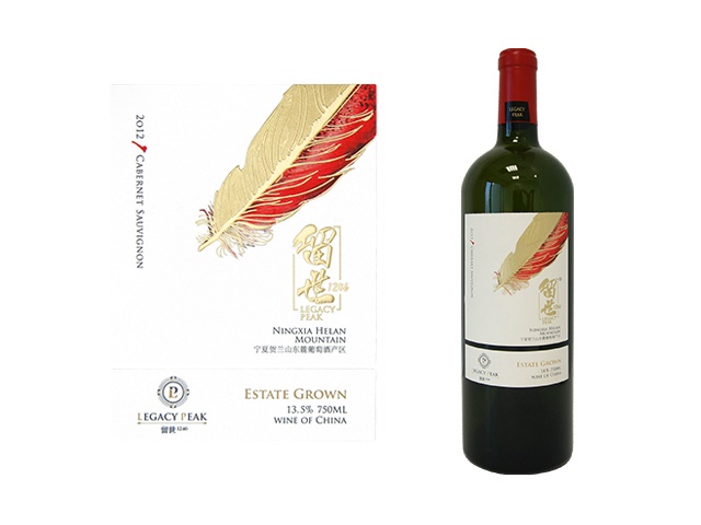
Success Stories: Ningxia Helan Mountain Cabernet Sauvignon Label
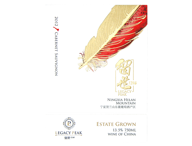
Requirements
- The product was limited and targeted high-end star hotel, so the wine label must contain clear description and match with vivid printing and meticulous gold stamping, to attract consumers’ attention and gave wine lovers great frist impression.
Solutions
- The new creative 3D gold stamping was finished with gold stamping, bumps effect and matte effect at once, which successfully reduce the process and achieve the exquisite effect.
- Customer planned to have a general gold stamping design, surprisingly, Cymmetrik gave the customer a 3D gold stamping feather with meticulous tactile feedback, gave this label a new look.
Success Stories: Caltex Torque Fluid Oil Drum Label
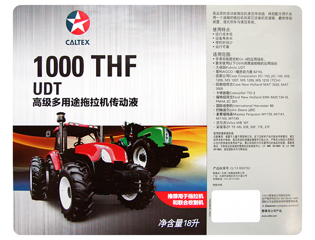
Requirements
- Customer had hope to used paper substrate as the printing material, but considered the adherend surface and storage environment, we suggested using PE material to avoid label shedding and wrinkles during the storage or transport process.
Solutions
- We used black screen printing and brushed finishing to emphasize the design of heavyweight tractors, and also used light grey color as the base color with black front words description to highlight the hair-brushed effect.
- Similar products mostly used light to dark color, this product color chose light gray to bring visual beauty, enhance product value.
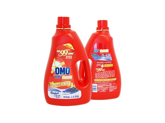
Success Stories: OMO Laundry Detergent (Lavender)
Requirements
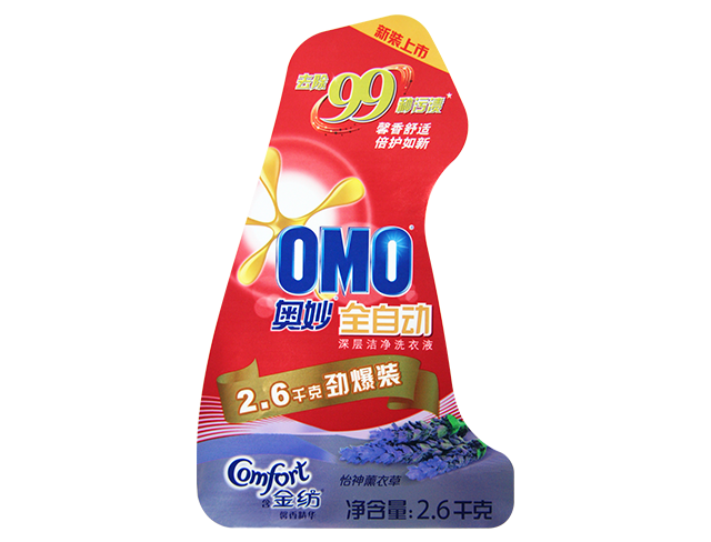
- Product appaearance upgraded. Customer hoped to change the previous paper substrate and required Cymmetrik to develop new printing material with material supplier.
Solutions
- Used PE Bright Silver as the printing substrate to increase a new and shiny effect.
- Cymmetrik especially developed an unique high wear-resistant varnish, which could replace film and saved the cost of carton partitions.
- The red background with bright yellow and lavender purple fully showed the feature of this detergent.
Success Stories: Hip Hop America Beer Primary and Secondary Labels
Requirements
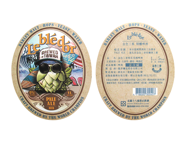
- Utizlied the comprehensive process ability to give various suggestions on customer's design. Used white material to present the color saturation and offset printing to print gradient color effect which was favored by customer.
Solutions
- The target consumer was young people, utilized offset printing to present the delicate gradient color, chose metallic ink to increase the quality and used matte cover film to achieve the vintage style.
- Matte treatment mixed with metallic ink could create differentiate effect with the bottle, successfully exceed other beer labels and attracted more consumers.
Success Stories: Maywufa Shower Gel Primary Label
Requirements
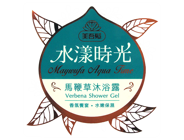
- At the beginning of the design, we gave the materials and printing process suggetions to the customer, and used verbena as the theme to have a futher discussion with the customer. Finally, we decided to use foil stamping on the rim of the leaves, which can grab more attetions.
Solutions
- This high end product using foil stamping on the design and the secondary label continued the streamline of the primary label, which set the value off.
- The bottle was dark green, so the label chose the natural color(blue, green, brown) and used some light colors to highlight, which increased the product quality and grab more attentions.
